<- Back
Make complexity understandable: redesigning the Roles & Permissions system to build trust and confidence
System Thinking. Information Architecture. Complex Workflow Design
“Clarity doesn’t come from hiding complexity, but from revealing it in a way people can finally understand—so they stop feeling lost inside the system and start feeling in control.”
ROLE
Senior Product Designer
YEAR
2024
TEAM
Product manager: Victor Alvarez
Engineer: Veselina Dimitrova
Senior Product Designer
YEAR
2024
TEAM
Product manager: Victor Alvarez
Engineer: Veselina Dimitrova
The Challenge
As Deel scaled rapidly, onboarding new clients became increasingly resource-intensive.
The Roles & Permissions system—responsible for access control across the platform—was so complex that clients couldn’t configure it on their own. Every new customer required an onboarding manager to manually walk them through the setup process.
This dependency limited Deel’s ability to scale and contradicted our vision of a self-serving SaaS platform.
“ Why can’t our clients understand and manage permissions on their own—and how might we enable them to do so confidently? ”
“ Why can’t our clients understand and manage permissions on their own—and how might we enable them to do so confidently? ”

Deel, a global HR SaaS platform
The Approach
Instead of simplifying the system, my strategy was to restructure complexity to make it understandable.
Through user interviews, I realized that confusion didn’t come from too much information—it came from a lack of context.
Users felt lost not because the product showed too many details, but because it didn’t show them in the right structure.
So I approached the redesign with a principle:
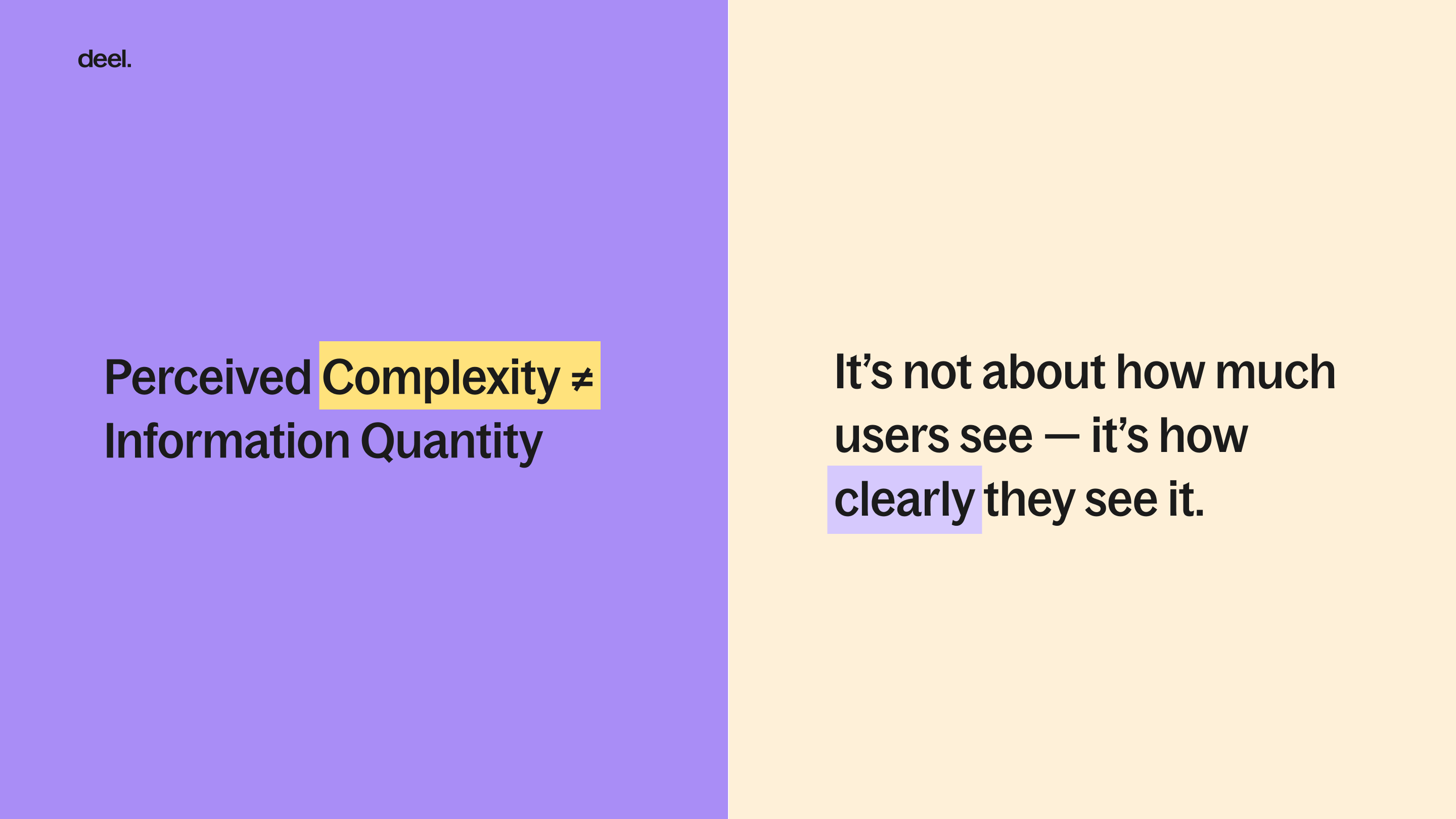
When complexity is made visible in the right way, users feel more in control—not more overwhelmed.
This philosophy guided every design decision:
-
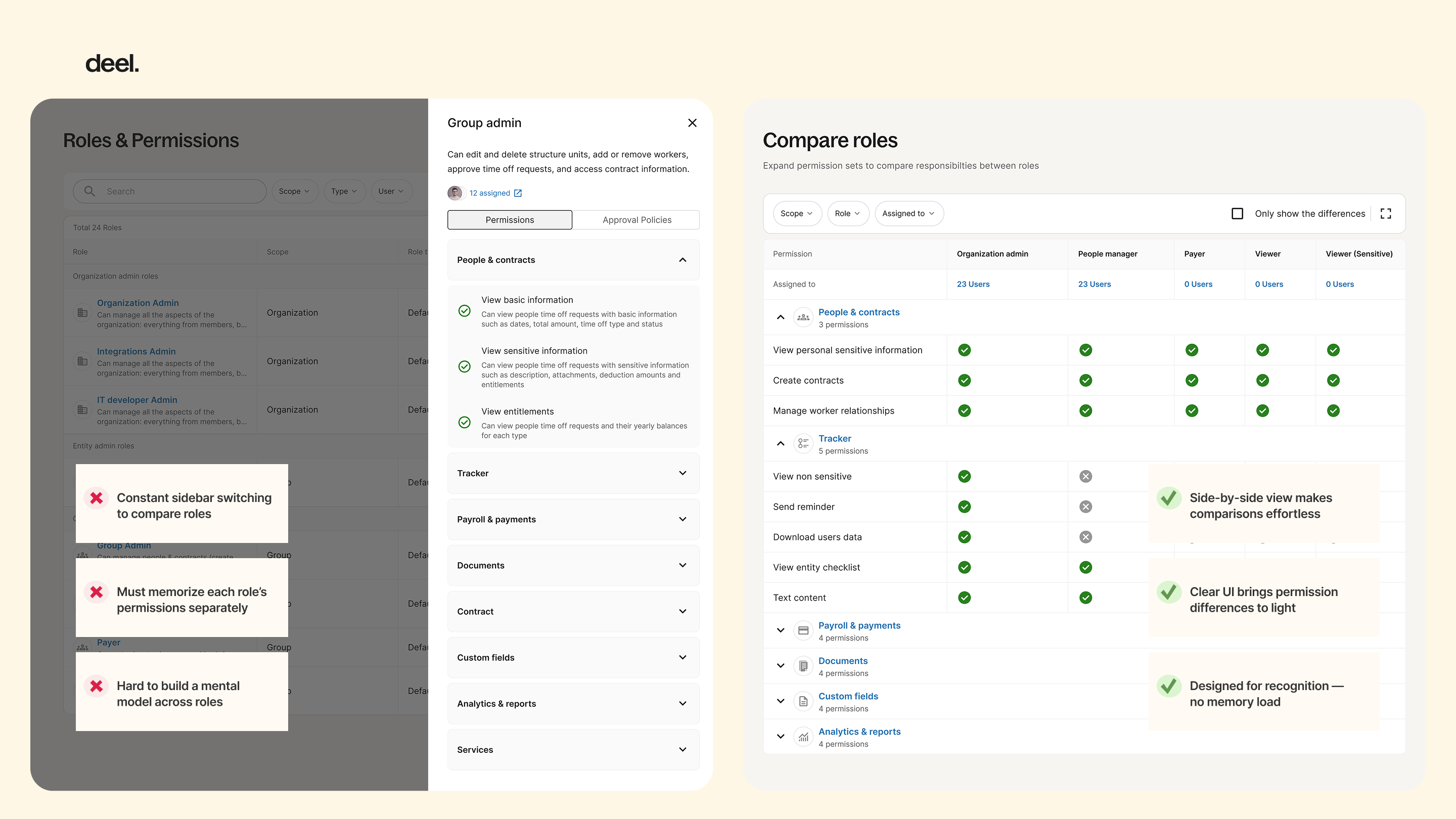
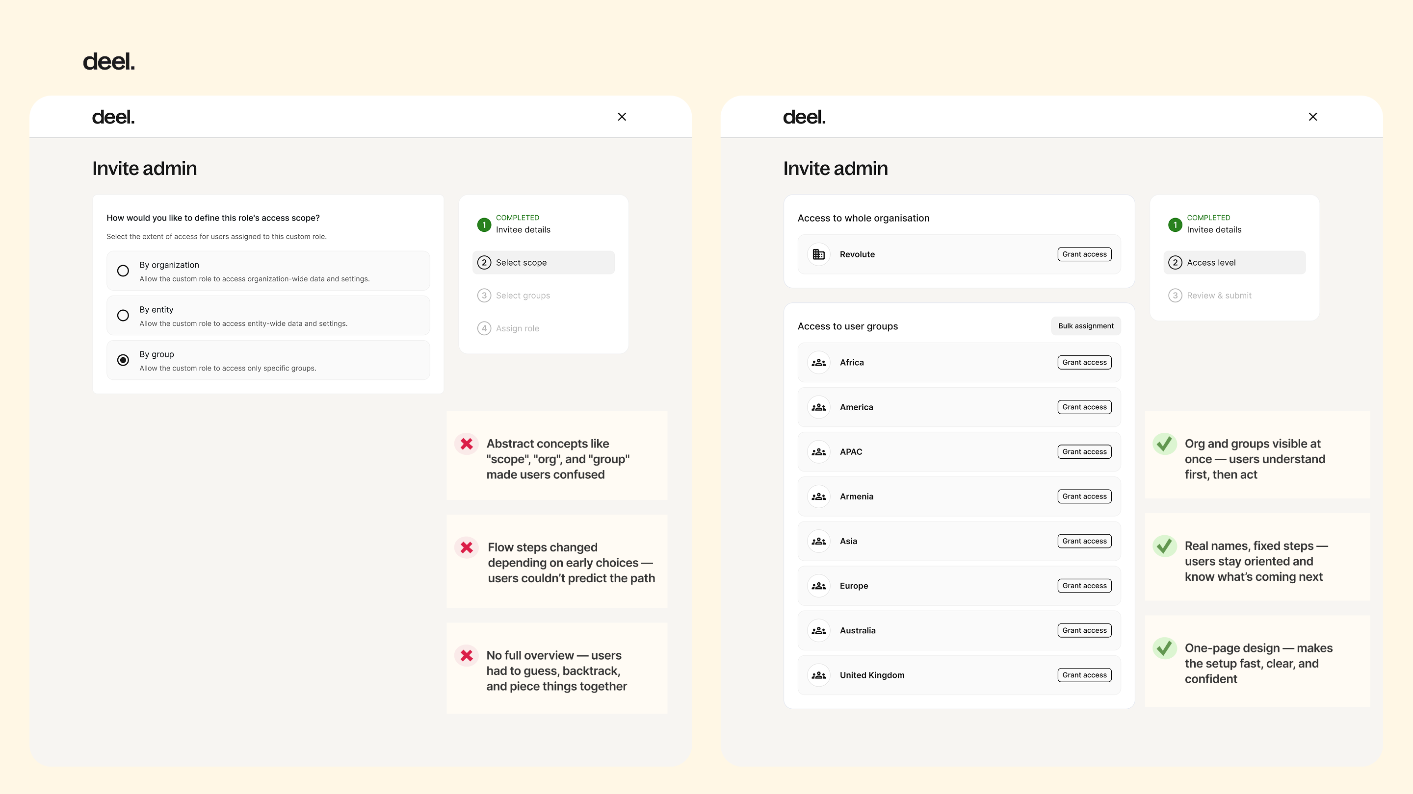
Rather than hiding details behind multiple steps, I brought related information into one structured view (as in the Compare Roles page).
- Instead of forcing users to decide on abstract concepts like “scope,” I merged context and action into a single screen (as in the new Invite Admin flow).
By revealing complexity through structure and context, the design helped users understand the system as a whole—seeing more, but thinking less.
The Process
To understand both the organizational bottlenecks and user-level mental models, I conducted dual-layer research:
-
Internal onboarding managers — to identify where clients usually got stuck and what required the most hand-holding.
- Client admins and HR leads — to learn how they assign roles internally and what causes hesitation or errors.
Schedule interviews
From these conversations, three key issues surfaced:
-
Unclear visibility: users couldn’t easily see what each role could access or perform, so every decision felt risky.
-
Technical exposure: abstract engineering concepts like “scope” (organization / group / entity) were surfaced directly in the UI, forcing users to make choices they didn’t understand.
- Lack of feedback: admins had no way to safely preview or validate permissions, making them dependent on onboarding managers for confirmation.
These insights shifted our focus from reducing information to revealing it meaningfully—helping users see complexity without feeling lost.
The Outcome
Guided by the principle “structure with context is better than steps with questions,”
I designed key improvements that made system logic visible, understandable, and actionable
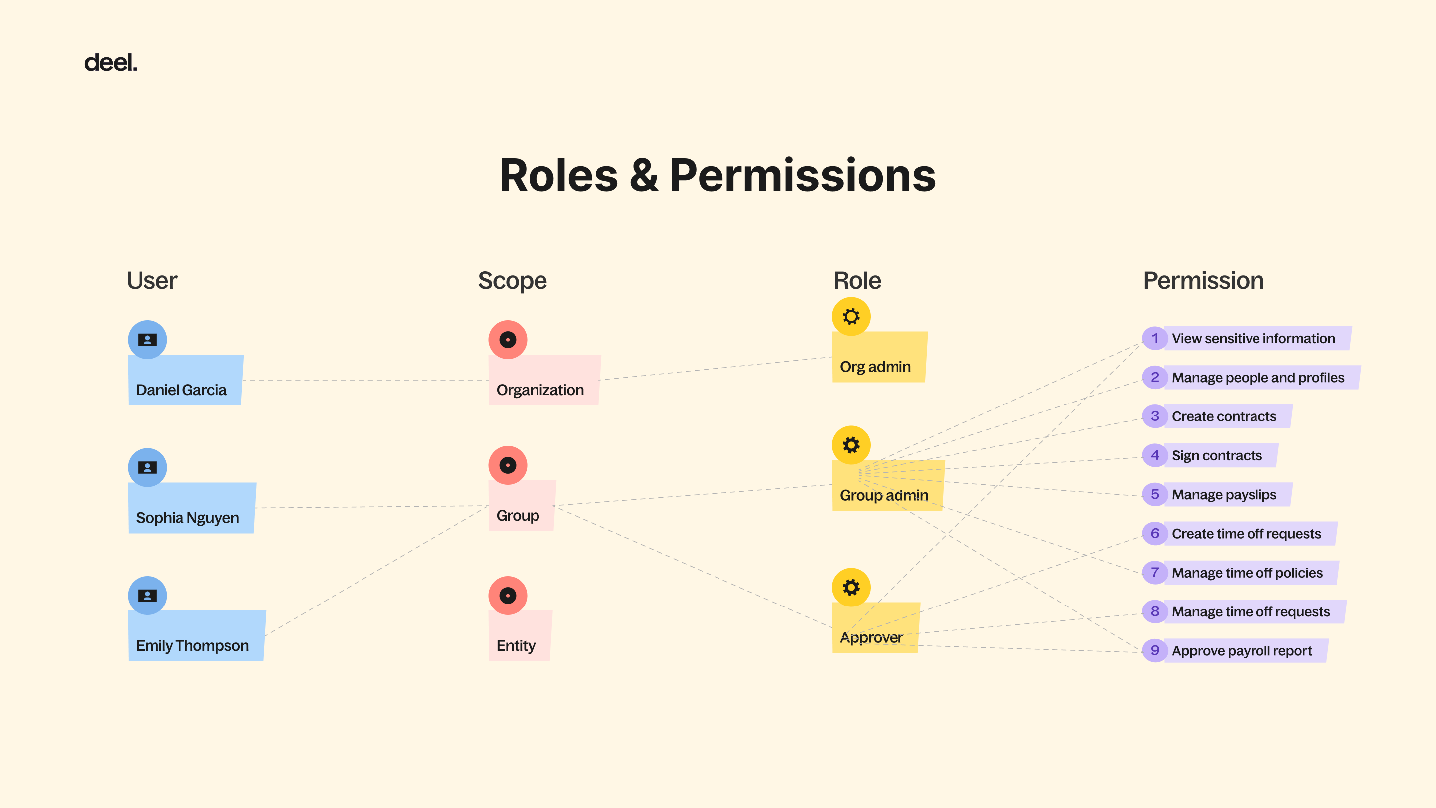
Role Comparison View — consolidated all roles into one page, enabling admins to visually compare permissions side by side instead of guessing across screens.
Invite Admin Flow — replaced the fragmented multi-step process with a single contextual view where users could assign roles across organization, group, and entity levels without needing to understand “scope.”
The Impact
The redesign significantly improved both client autonomy and internal alignment across teams.
After the launch, onboarding managers reported a sharp decrease in client dependency during setup, and follow-up interviews with clients revealed a clear shift in perception—users felt more confident and in control when managing permissions on their own.
Beyond external impact, the Compare Roles feature also became a valuable internal reference. Designers and PMs across other product teams began using it to understand the platform’s role logic, turning what was once an opaque technical system into a shared, transparent framework for collaboration.
The Reflection
This project changed how I think about simplicity in design.
I used to equate good design with reducing complexity—but I’ve learned that, in system design, true simplicity comes from visibility and structure, not omission.
When users can see how a system works, they stop feeling lost and start feeling in control.
Designing for clarity, not minimalism, became one of my lasting principles.